
Problem Space
People love beauty products and often invest their time and money in them. They often find it challenging to choose the right shade of makeup or the right beauty products without having a tester or a sample, which is not available in all the beauty stores, often leading people to choose the wrong product.
Goal
Design a brand new app that could take away some of the hassles people have in discovering the right product and help them choose the right Product.
User Research
Screener surveys helped me in finding the relevant candidates for follow-up interviews. I focused on asking open-ended and straightforward questions to uncover the characteristics of how people shop for beauty products and how they research a product before purchase, if at all. Then I conducted Interviews to learn more about their process and pain.
Insightful Quotes
Personas
One of the challenges in designing is keeping others’ perspectives in mind, even if I could be a potential user. I didn’t want to let bias drive the design, so I used my interviews to create Personas and Empathy Maps, which put a face to each of my users and allowed me to stay focused.
User Stories

I decided to create an MVP (Minimum Viable Product) because introducing fewer features can minimize risk during development. Through testing, I could determine whether the MVP matched my user’s needs. I created a list of user stories detailing the most important items to my users.
Information Architecture
Site Map
I begin my sitemap by Visualizing all the pages that are necessary.
User Flows
I created scenarios that my personas would likely be doing on the mobile app based on their goals derived from the empathy maps. To visualize these scenarios, I began sketching out the user flow.

Sketches
With all the information gathered, I started my favorite part of the design process: Sketching
It allowed me to visualize the content and flow and see what features were required. After a few iterations, I had a working model from which I could begin building my wireframes.

Guerilla Usability Testing
Guerilla usability testing gives initial feedback on designs. An interactive prototype with Marvel is used for performing tasks.
The most significant insights from the session
People expressed that they want the product discovery recommendations to advise their skin concerns instead of general suggestions.
People expressed that they want the compare option of the product discovery to compare two products.
My Recommendations
Change the compare option to Related products, which seems to be more relatable.
Include the user’s skin type and skin concerns in the user’s bio, making it easier for them to relate their products.
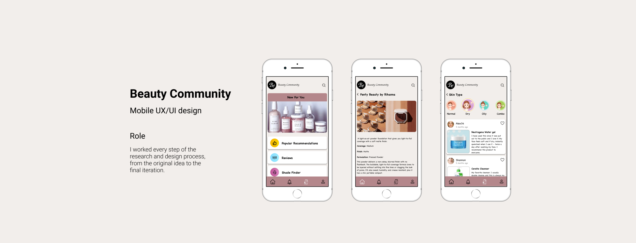
Wireframes
To more clearly visualize and analyze the sketches, I created wireframes. I used Adobe XD to create vital digital wireframes. It’s an excellent tool for ideating screen layouts efficiently while displaying beauty community user flows.

Users wanted to search for a product through Ingredients to know more Information

I divided the Recommendations to further cater the product to their particular needs

Search for people using particular product

This gives users the reviews of a particular skin type.

This is the heart of the app, where users can get any information about any product .

Users can see what other people of similar beauty concerns are using.
Prototype
Screen layouts developed from the flowcharts, sketches, and wireframes, put together into a single prototype, which will be used for continued user research. It was ready to handle the vital task of gauging the beauty community app’s user experience and discovering if the app’s features are user-centered and needed.


usability Testing
Usability Testing enabled me to see how the design matched user needs. Usability is a competitive advantage.
I wanted to test the following in my Prototype.
Are the users able to find more information about any beauty-related products?
Are the users able to find a foundation shade?
Will the users find it easy to navigate the app and find out about specific beauty products suitable for their skin type?
How would the users feel about the flow of the app?
Coming to the tasks
Finding a foundation shade took a long process for the users to navigate through the app. They Expressed the concern for having a specific feature for finding their foundation shade. With all this information gathered, I moved forward by iterating on pain points and Redesigning the features and user flows that weren’t clear to the users.


Conclusion
Designing the Beauty Community app allowed me to hone my design skills and grasp the UX design profession’s current state. I also reinforced my understanding of the UX Design process, a collection of practices that allow a designer to define a problem, ideate possible solutions, and find real answers with user feedback guidance.
Throughout my user-centered design process journey, I learned so much about gaining empathy for the user and understanding their motivations, goals, and desires. Having a deep understanding of human emotions and behaviors and finding out why these things are so important to them has helped me advance my knowledge even as a UX Designer.
I enjoyed the visual design process and learning to use Adobe XD and InVision to build wireframes and create a prototype for user testing. I believe that human-centered design has the power to improve lives. Design is about iterations and changing things to make it easier and better for the user to understand and follow.
While you are here, check out my other projects

Huddle
A one-stop Destination for Entertainment

eCOA
A Multiplatform UX/UI design to help reduce the time of Clinical Trials

Y-Labs Ventures
A desktop website UX/UI design to develop a E-Learning Platform