
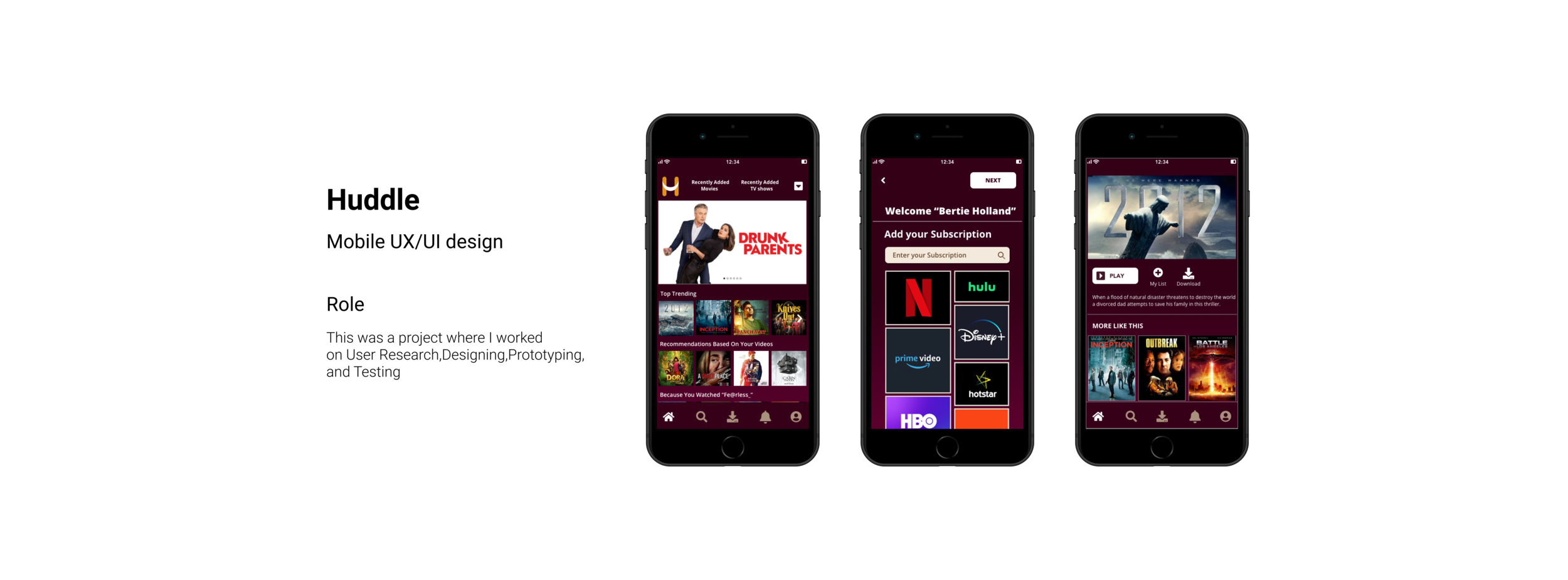
Problem Space
People love watching movies and TV shows; often, they have more than one SVOD (Subscription Video On Demand) to catch up on them. It is always a hassle to go from one SVOD to another to watch something they are interested in as they are frequently updated all the time by new content.
The Challenge
As the number of people using SVOD increases, designing a universally easy-to-use app without adding the burden of shuffling between them was the most prominent design challenge.
Discovery
To better understand the driving habits and frustrations of my users, I asked myself these questions while generating a user research plan:
Why do people even have more than one SVOD service?
How effortless is finding a new video uploaded recently?
How do they feel about switching between the apps?
I collected data utilizing Individual Interviews.
User Interviews
To understand the user needs, what they think, their problems, and pain points. Used a short screener survey to help ensure the users have access to multiple content providers.
“I have to search on the internet to find if a show is available in the subscriptions she owns.”
“I don’t like to browse between the apps searching for a movie or show”
Affinity mapping

Empathy Mapping & Persona
Using my research results, I developed personas based on the commonalities I saw in the research participants. Primarily, the people I interviewed fell into two similar groups.
The binge-watching Bhuvan.
Time constraint Tammy.
Design
User Stories
User stories helped to identify the functional needs of the product. It helped to keep the design user-centered. I created user stories to describe the type of user, how they will use the app, what they wanted, and the tasks or goals that users can accomplish.

User Flows
User flows visualize the red routes of my app. I created three user flows based on the below paths:
Add Content providers
Add different profiles
Homepage
Sketches
Sketches for Adding multiple subscriptions and multiple profiles into the app, as they are the primary requirements of the users.

Guerilla Usability Testing
Through Guerilla Usability Testing, I wanted to discover whether the app communicates what the user is looking for, anything that the user is baffled about. I have given them a few tasks to perform on my interactive prototype with Marvel. The most significant insights from the session were.
Users were trying to add SVOD through the login page instead of the sign-up page.
Most of the users did not understand the meaning of SVOD.
Recommendations:
According to the insights I found from the Guerilla Usability Testing, the changes I implemented in my design include.
To allow the users to add SVOD in later stages after the signup process, which lets them add any SVOD at any point in time.
I would like to change the option of “Add SVOD “to “Add your subscription,” making it easy for users to understand.
Wireframes
After the guerrilla usability testing, I made some of the necessary changes to improve the user interaction based on the findings and created the mid-fidelity wireframes using Sketch.


Renaming SVOD as Subscription
Renaming the term as subscription made a lot of difference as users were not familiar with the term SVOD.
Adding Subscription whenever required
Users wanted to have the flexibility of adding subscriptions into the application whenever required.
Mood Board

After creating the sketches, it’s time to add aesthetics to the designs by creating mood boards used to compile inspirational elements (like colors, images, and patterns). For Mood Board, I chose to represent a combination of dark and light colors, which provides contrast on the screen.
The dark background gives the users a cinematic experience of watching shows, and the light on dark stands out a lot better.
Style Guide

The chosen font Open Sans is a clear and well-balanced typeface.
It has a very low ‘Visual noise,’ making it easy for users to maneuver in the dark background.
The color palette and buttons provide a contrast in colors for easy identification.
VALIDATE
Prototype
I created clickable prototypes by importing my wireframes (updated to include the style guide) into InVision.


Usability Testing
For HUDDLE usability testing sessions, I interviewed four people who fit into users’ categories with access to multiple content providers’ platforms.
I assigned the testers some basic tasks that I wanted them to complete:
Create two different profiles.
Add the subscription.
Watch the content from Netflix and Hulu only.
Save a movie to watch offline.
Remove a subscription from the app.
Overall the users were able to complete the tasks with ease for creating a profile, watching content from specific providers, saving a movie, and removing a subscription.
Areas of Improvement
1.They had the same content in more than one provider. Users wanted to know the source of their streaming content.


Conclusion
Key Takeaways from this experience:
Every user interaction teaches you something.
Small, frequent iterations of product designs allow for easier course correction early in the process.
Designing your products based on your users’ needs instead of your assumptions leads to better outcomes.
Through the short discussions that I had with the interviewees after the moderated usability tests, the interviewees agreed that I should make the app and are excited about it. Overall, I felt inspired to keep making iterations, which will allow me to improve as a UX Designer, giving me a chance to make the app a reality.
While you are here, check out my other projects.

Y-Labs Ventures
A desktop website UX/UI design to develop a E-Learning Platform

eCOA
A Multiplatform UX/UI design to help reduce the time of Clinical Trials

Beauty Community
Bringing Beauty Enthusiasts Together